How I structured a React frontend for a coffee shop app
This is a walkthrough of the frontend architecture I built for Beanworks, a fictional specialty coffee shop. The goal was to treat it as a real production project: a custom design system, typed API layer, Storybook integration, and JWT-based auth with role guards.
Tech stack
| Tool | Purpose |
|---|---|
| React 19 + TypeScript | UI and type safety |
| Vite + Tailwind CSS v4 | Build tooling and styling |
| React Router v7 | Client-side routing |
| TanStack Query (react-query) v5 | Server state and caching |
| Zustand v5 | Client state (auth) |
| react-hook-form + Zod | Forms and validation |
| Framer Motion | Animations |
| Storybook 8 | Component development and docs |
| class-variance-authority (CVA) | Component variant API |
Folder structure
src/
├── api/           # Axios client + typed API functions
├── components/    # Feature components (auth, products, layout, etc.)
├── design-system/ # Primitive UI components + design tokens
├── hooks/         # TanStack Query (react-query) wrappers
├── pages/         # Route-level page components
├── router/        # Route config + PrivateRoute guard
├── store/         # Zustand stores
├── types/         # Shared API types
└── utils/         # cn, formatCurrency, formatDate
The split between components/ and design-system/ was deliberate. design-system/ holds primitives like Button, Card, Input, and Badge that have no domain knowledge. components/ holds feature-specific things like CoffeeBeanCard and LoginForm that compose those primitives.
Design system and tokens
Instead of scattering raw hex values through component files, I defined a token file:
// src/design-system/tokens/colors.ts
export const colors = {
  brand: {
    warmWhite: '#FAF9F6',
    beige: '#EDE7DD',
    charcoal: '#2E2E2E',
    brown: '#A67C52',
    sage: '#A8B2A1',
  },
  primary: {
    DEFAULT: '#A67C52',
    hover: '#8F6844',
  },
  text: {
    DEFAULT: '#2E2E2E',
    muted: '#7A7266',
    subtle: '#B0A89C',
  },
  // ...
} as const
Components then reference CSS variables instead of the token values directly, so a future theme swap doesn't require touching every file.
For component variants, I used CVA. Here's the Button as an example:
const buttonVariants = cva(
  ['inline-flex items-center justify-center gap-2 font-medium rounded-xl', 'transition-all duration-[250ms]'],
  {
    variants: {
      variant: {
        primary: ['bg-[var(--color-primary)] text-white', 'hover:bg-[var(--color-primary-hover)]'],
        secondary: ['bg-[var(--color-surface-elevated)]', 'border border-[var(--color-border)]'],
        ghost: ['bg-transparent', 'hover:bg-[var(--color-surface-elevated)]'],
        danger: ['bg-red-50 text-red-700 border border-red-200'],
      },
      size: {
        sm: 'h-8 px-3 text-sm rounded-lg',
        md: 'h-10 px-5 text-sm',
        lg: 'h-12 px-7 text-base rounded-2xl',
      },
    },
    defaultVariants: { variant: 'primary', size: 'md' },
  },
)
CVA keeps variants co-located and makes the props contract explicit via VariantProps<typeof buttonVariants>.
API layer
All HTTP calls go through a single Axios instance in src/api/client.ts. The two interceptors do the heavy lifting:
- Request interceptor: reads the JWT from localStorage (via Zustand's persist key) and attaches it as a Bearer token
- Response interceptor: catches 401s, clears the stored auth, and redirects to
/loginwith the current path as a?redirectparam
apiClient.interceptors.response.use(
  (response) => response,
  (error) => {
    if (axios.isAxiosError(error) && error.response?.status === 401) {
      localStorage.removeItem('coffee_shop_auth')
      window.location.href = `/login?redirect=${encodeURIComponent(window.location.pathname)}`
    }
    return Promise.reject(error)
  },
)
Typed functions in src/api/products.ts and src/api/auth.ts wrap the client. Each function returns a typed DTO, so the rest of the app never deals with raw any responses.
Data fetching with TanStack Query (react-query)
Rather than calling the API functions directly in components, each data type gets its own hook in src/hooks/:
export function useCoffeeBeans() {
  return useQuery({
    queryKey: ['coffeeBeans'],
    queryFn: getCoffeeBeans,
    staleTime: 5 * 60 * 1000,
  })
}
Pages just call useCoffeeBeans() and destructure { data, isLoading, isError }. The 5-minute stale time means navigating between pages doesn't re-fetch unless the data is actually old. Query keys are defined as typed as const arrays to prevent key typos from causing cache misses.
Auth state with Zustand
Auth lives in a single Zustand store with the persist middleware:
export const useAuthStore = create<AuthState>()(
  persist(
    (set) => ({
      token: null,
      user: null,
      isAuthenticated: false,

      login: (token: string) => {
        const claims = jwtDecode<JwtClaims>(token)
        const roles = claims['http://schemas.microsoft.com/ws/2008/06/identity/claims/role']
        set({ token, user: { email, firstName, roles }, isAuthenticated: true })
      },

      logout: () => set({ token: null, user: null, isAuthenticated: false }),
    }),
    { name: 'coffee_shop_auth' },
  ),
)
On login, the JWT is decoded client-side with jwt-decode to extract the user's email, given name, and roles. The backend here uses .NET's default claim URI format for roles, so the decode maps that long URI key into a plain roles: string[] array the rest of the app can use.
The store persists to localStorage under the key coffee_shop_auth. The Axios interceptor reads from that same key, which avoids any import-cycle issues between the store and the client.
Route guards
PrivateRoute wraps protected pages and handles two cases: unauthenticated users and non-admin users trying to hit admin routes.
export function PrivateRoute({ children, requireAdmin = false }: PrivateRouteProps) {
  const { isAuthenticated, user } = useAuthStore()
  const location = useLocation()

  if (!isAuthenticated) {
    return <Navigate to={`/login?redirect=${encodeURIComponent(location.pathname)}`} replace />
  }

  if (requireAdmin && !user?.roles.includes('Admin')) {
    return <Navigate to="/" replace />
  }

  return <>{children}</>
}
Usage in the route config is straightforward:
<Route
  path="/admin/products"
  element={
    <PrivateRoute requireAdmin>
      <AdminProductsPage />
    </PrivateRoute>
  }
/>
Storybook as the frontend's Swagger
If you've worked on a backend API, you've probably used Swagger UI to browse endpoints, inspect request/response shapes, and fire off test requests without writing any code. Storybook does the same thing for UI components.
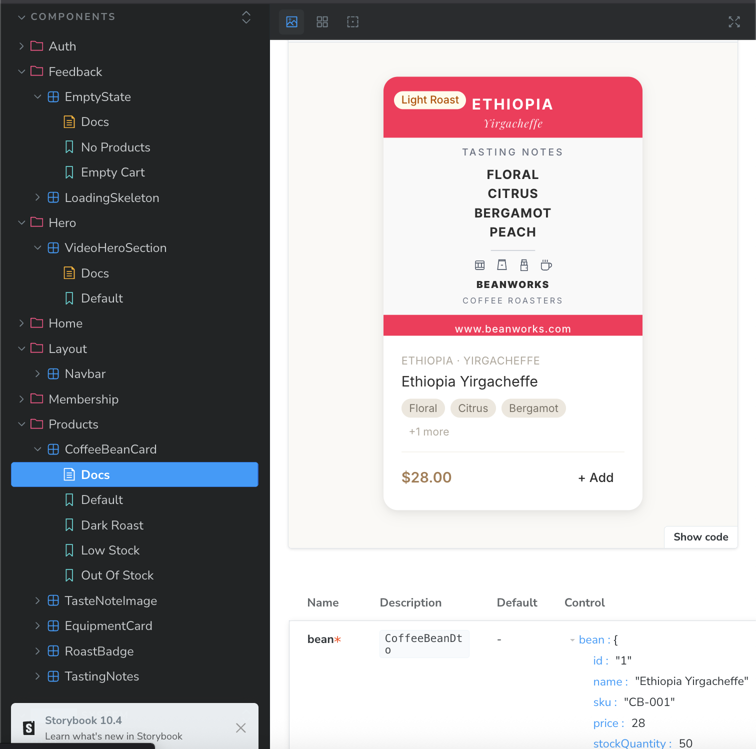
Every component gets a .stories.tsx file that lives right alongside it. Each story maps to a named variant — Default, Bronze, Silver, Gold for a membership card; Default, Dark Roast, Low Stock, Out Of Stock for a coffee bean card. Anyone on the project can open Storybook, browse the catalogue, and see every visual state without needing to reproduce it in the running app.
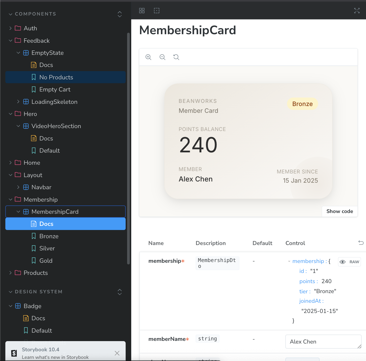
The props table at the bottom is generated automatically from TypeScript types. It shows every prop name, its type, whether it's required, and a live control to change it in real time. For MembershipCard, the membership prop is typed as MembershipDto, so the table lists all the fields (id, points, tier, joinedAt) and lets you edit them directly.
This project uses @storybook/addon-a11y for accessibility auditing on each story and @storybook/addon-themes for theme switching. The a11y addon in particular catches contrast and ARIA issues at the component level, before they reach the page.
A few concrete benefits this gave me:
- Backend-free development. Stories use hardcoded fixture data, so I could build and refine
CoffeeBeanCardandMembershipCardwithout a running API. - Variant coverage. Writing a
Low Stockstory forced me to actually implement the low-stock visual state, which I might have skipped if I only tested through the app. - Living documentation. The stories serve as examples for anyone reading the code later. Instead of guessing what props a component accepts, you open Storybook and see it.
Path aliases
Vite's resolve.alias maps the most-used directories to short imports:
alias: {
  '@': resolve(__dirname, './src'),
  '@ds': resolve(__dirname, './src/design-system'),
  '@components': resolve(__dirname, './src/components'),
  '@pages': resolve(__dirname, './src/pages'),
  '@hooks': resolve(__dirname, './src/hooks'),
  '@store': resolve(__dirname, './src/store'),
  '@api': resolve(__dirname, './src/api'),
}
So instead of ../../../design-system/components/Button, any file can write @ds/components/Button. TypeScript picks these up via the matching paths config in tsconfig.json.